Weight Watchers Guest Site 2020
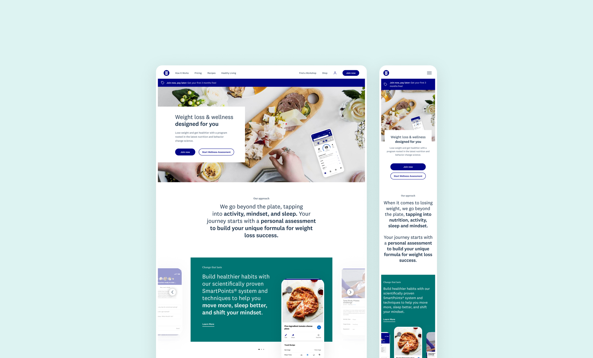
Led a revamp of the Weight Watchers visual identity and user experience on the .com site, leading to a 12% increase in conversion.
Role: Research, UX Design, Visual Design, Design System
Year: January 2020
Client: Weight Watchers
Platform: Web

Project Overview
In conjunction with the launch of a new food program, leadership tasked the Growth team with a complete redesign and overhaul the current guest site and CMS system.
Discovery Workshop
To kick off the project, we conducted a 2-day workshop with our agency partner Punchcut in order to get their team up to speed and come to a general alignment and understanding of goals.
Business understanding
Overview of the business. Discuss major milestones, objectives, vision, and success metrics for WW.com.
Product understanding
Overview of the myWW app, WW.com, WW store and how they fit within the WW ecosystem. Review the existing website and competitors. Identify focus areas.
WW experience Audit
Competitive analysis
Getting Aligned
Getting aligned with leadership
We ran a few exercises to get alignment with stakeholders on the brand, visual and motion design direction.
Experience attributes
We went through an exercise to determine what attributes we did and did not want the new experience to personify.
We narrowed it down to six key attributes
Bold
Personal
Welcoming
Modern
Joyful
Focused
Visual spectra
Motion spectra

Project Goal
Over the course of 10 weeks, design and test concepts for the WW guest site that build a narrative, express the new brand and increase conversion.
Ideation
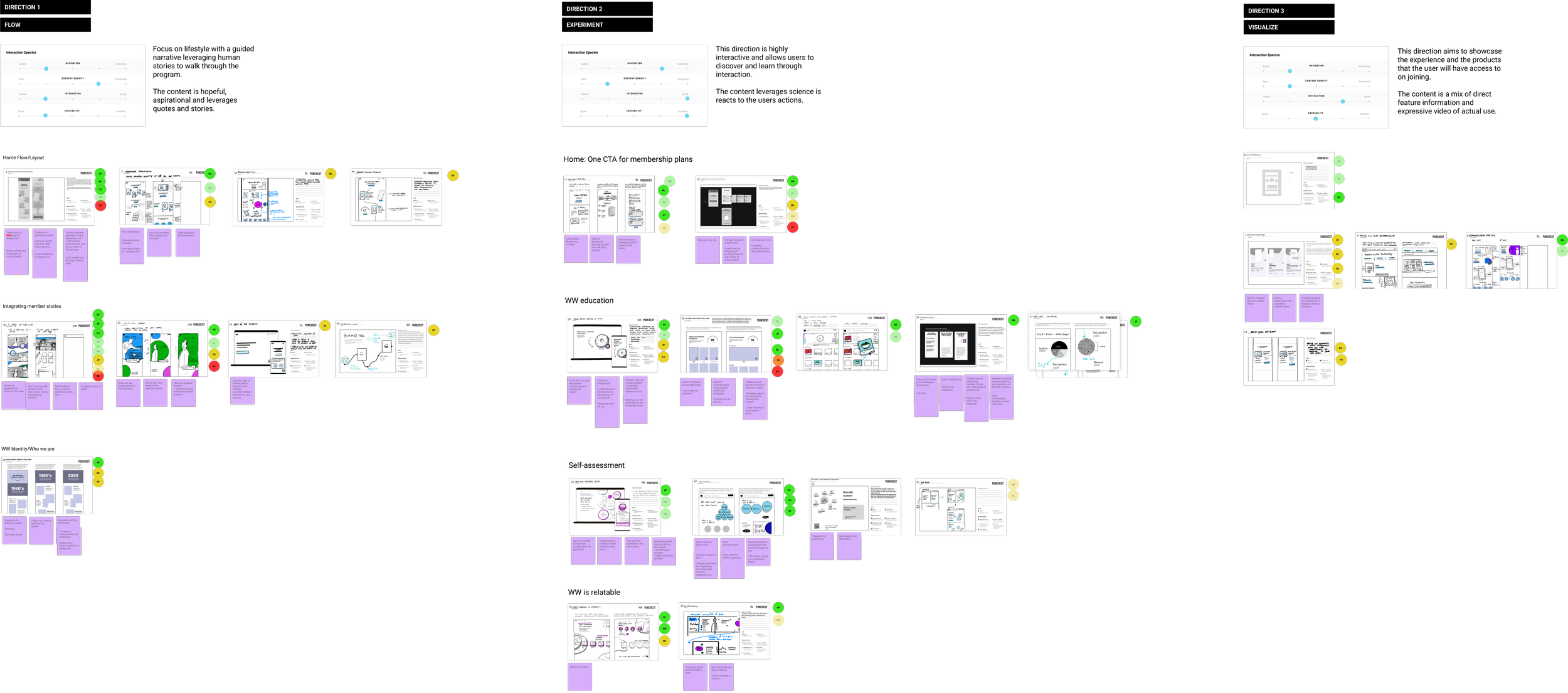
We kicked off ideation with a concept sketching session which included designers, PM’s, research, engineers and stakeholders.
Everyone sketched homepage ideas for. the new site based on the discovery work. We then broke those down further into themes that began to emerge.
Dot voting
In order to pick which concepts to pursue, we conducted a dot voting session where everyone picked their favorite ideas. We then broke those down into three distinct directions to take to higher fidelity designs.
Three directions
The three directions we came up with were based around connection, experimentation and trust. Each came with it’s own content hierarchy and motion spectra.
Visual Explorations
Based on feedback from the workshop, we simultaneously began to explore visual directions for the new guest site.
Using a collage of images we collected for inspiration, we went through an exercising of selecting the images that were closest to a look and feel we might want to pursue. We then grouped like imagery and turned those into 6 vision boards to express possible direction.
The directions ranged from mild to very spicy.
Narrowing it down and refining the designs
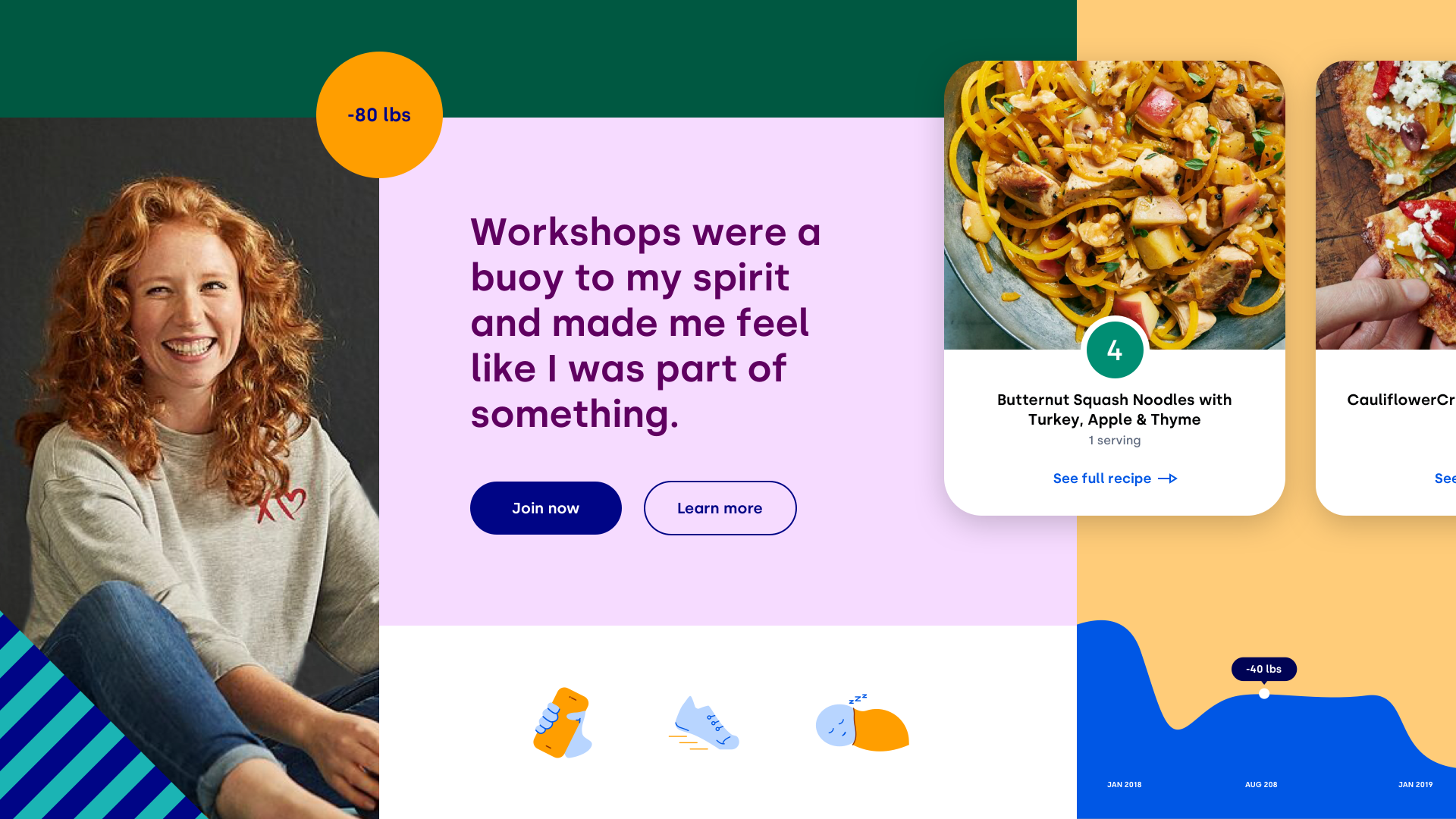
After presenting to leadership we narrowed it down to two visual design directions to test.
Green Pepper (mild)
Fresh (hot)
XR Testing
For our XR testing, we coupled our favorite two directions from the content hierarchy with the two visual design directions.
In-depth findings
Key themes
Design System
Once we had the visual direction nailed down, we began to create a design system to be used across the guide site.
This design direction would ultimately translate across the brand to our member app and all marketing communications.
Site Redesign
A new user experience
Old site
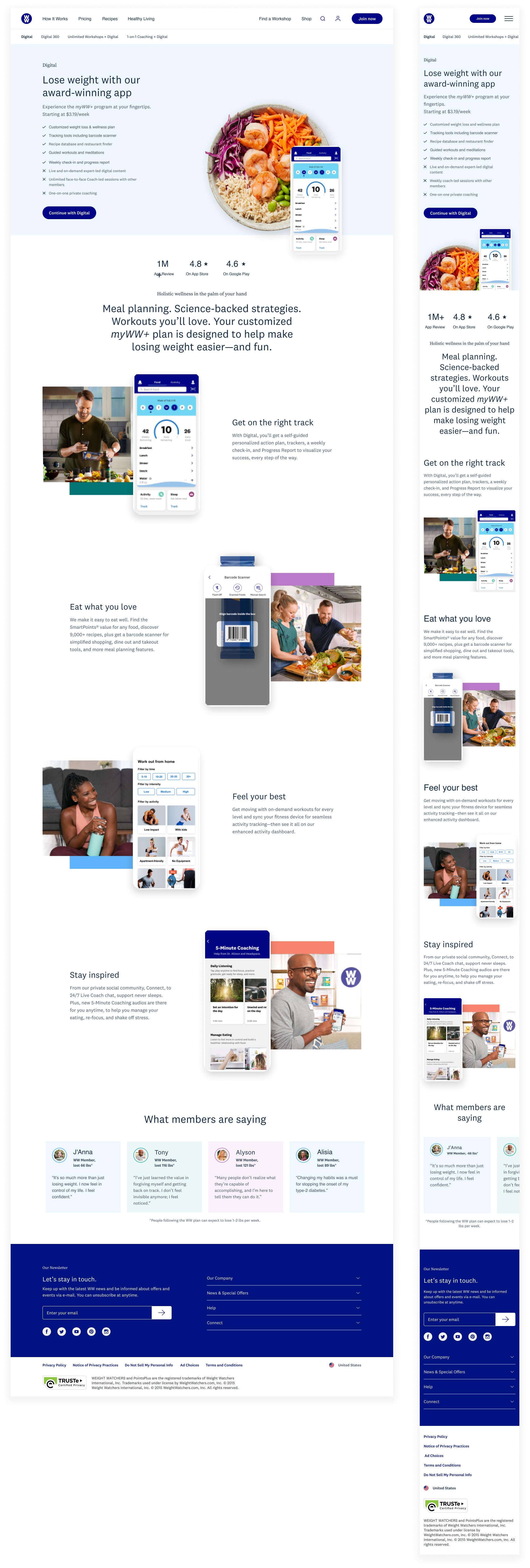
New site
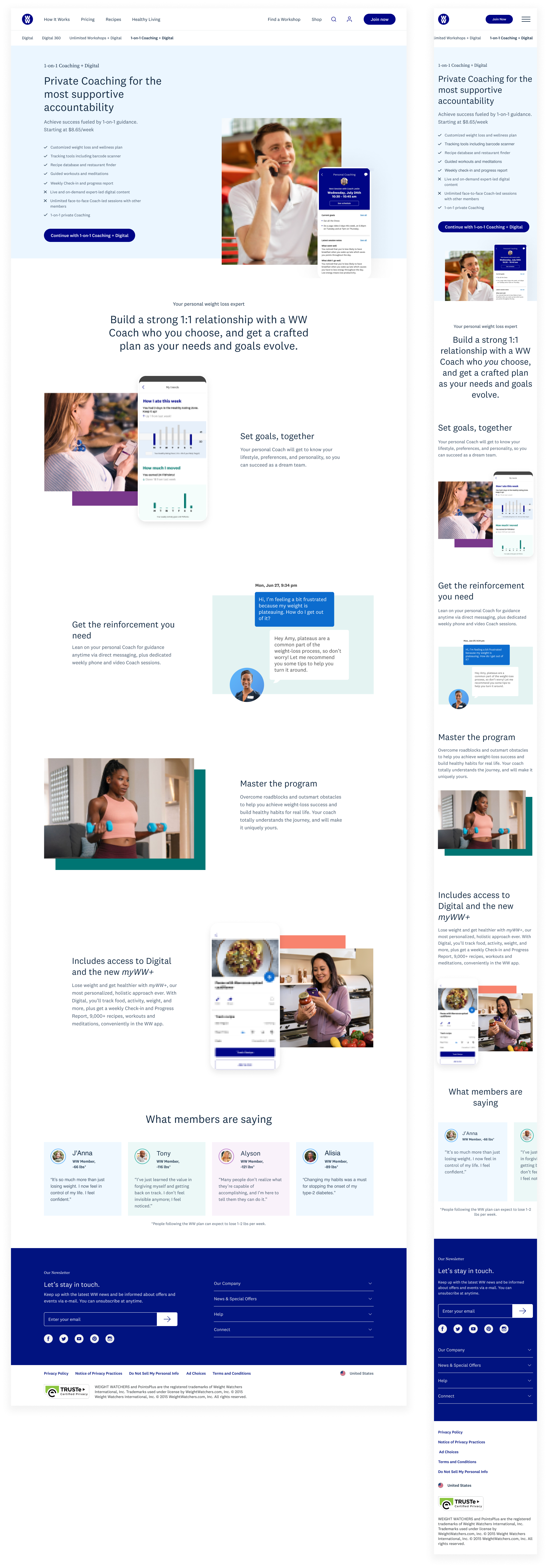
Final site pages
App Explorations
Now that the .com site was complete, I spent some time thinking about how the new visuals and brand guidelines could translate to our member app.
Here are some early explorations…


