Walmart Pay & Benefits
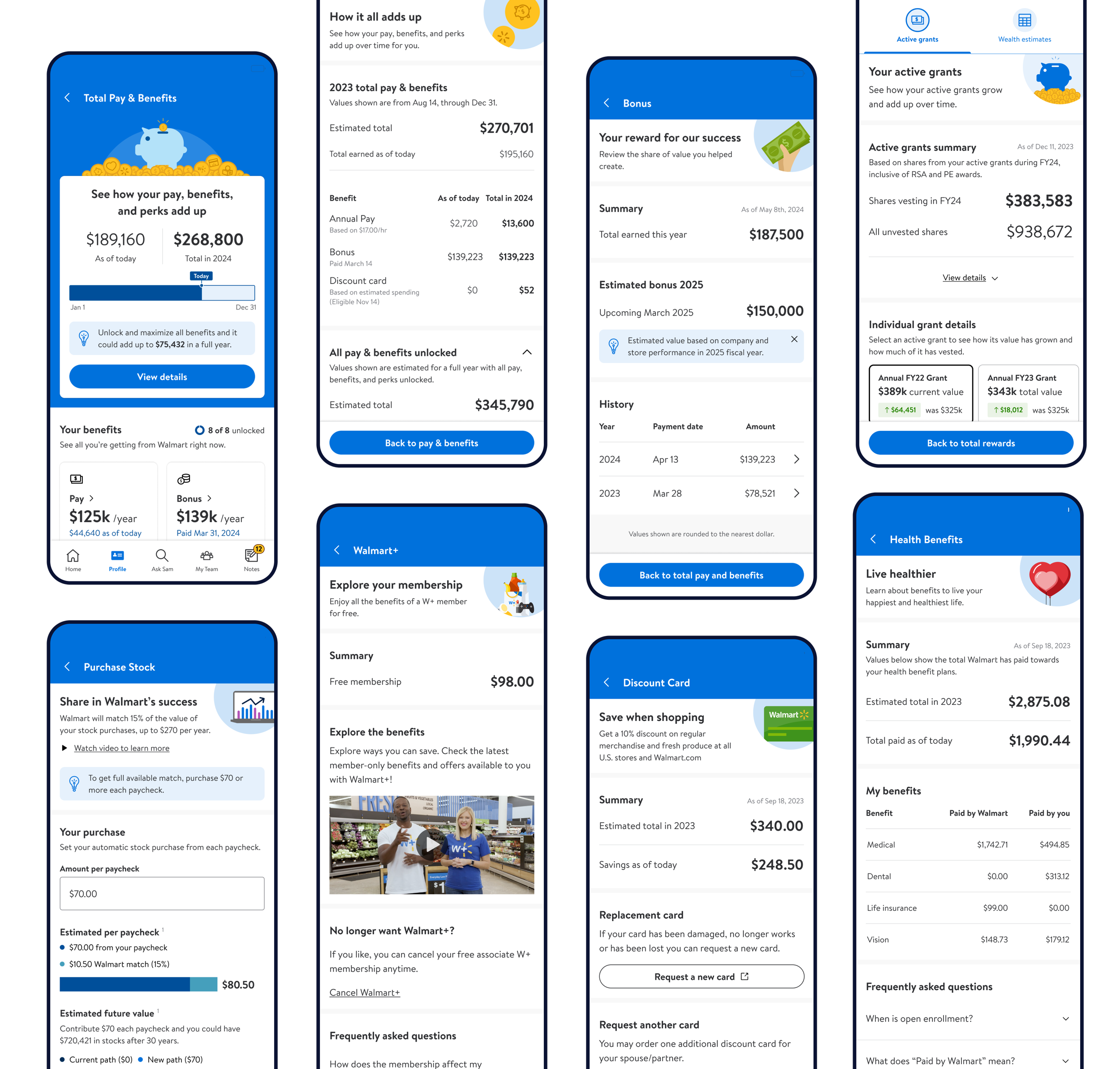
A 0-1 employee benefits dashboard that increased adoption of key benefits by 8% and enrollment in benefits by 11%.
(Full project coming soon)
Role: UX Design, Visual Design
Year: June 2024
Client: Walmart
Platform: iOS/Android

Defining the problem
Problem 1
Employees focus on base pay alone instead of all of benefits Walmart offers, leading to high attrition
Walmart is a Fortune 1 company with over 2 million employees, but has struggled to retain talent.
Problem 2
Information about pay and benefits was scattered across sites, making it hard to find.
Employees were struggling to find information on their pay and benefits and comprehend their benefits holistically.

Opportunity
Create a compelling, personalized experience that facilitates easy discovery and comprehension of benefits; and empowers employees to maximize the full value of their compensation and benefits.
Outcomes
I mapped out outcomes to help understand the impact we needed to have to be successful.
01
Associates see beyond their hourly rate/annual salary with a clear understanding of the annual total of all benefits, which leads to higher retention
02
Associates discover and adopt new benefits at higher rates than today
03
Associates have increased financial literacy and can confidently articulate what each of their benefits is
Key Personas
Who should we build this for?
We knew we needed to build for at least 5 personas across 4 different platform apps. I determined we should focus on Field Hourly associates, as they are by far our biggest population (> than 1 million).
Design Strategy
Design Strategy
I worked closely with Product and Business partners to help define the work and began to form a design strategy.
Create a system of benefits
Each benefit is unique, but all are part of the overall benefits story. We aim to make this story clear both from a high-level perspective and in the details of each benefit.
Always show annual projections and year-to-date progress
Provide associates with a clear view of the total value of their rewards by the end of the year, so they always see the bigger picture.
Highlight Walmart Contributions
We want to clearly communicate the financial value that Walmart offers through its benefits. This story should not be overshadowed by what associates contribute (e.g., 401k contributions).
Ideate and validate
Wireframing the experience
We wireframed out a robust, end-to-end experience to test using existing design system components and net new patterns like data visualization.
Ideate & validate
Testing Pay & Benefits
Moderated Associate Interviews
Hourly Store Associates
9 Walmart associates
Focusing on: Language, usability, comprehension of primary benefits
Unmoderated Usability test
Sample of non-associates
15 participants (3 groups of 5)
Focusing on: Language & usability across all benefits
Key takeaways
Synthesizing research findings
✅
💰
Easy to understand
They liked having an easy way to see what they are enrolled in (and not enrolled in)
Walmart contributions
The focus on Walmart contributions confused associates, they expected the experience to be a place to manage their money
🔒
🗣️
Unlocking drives motivation
The notion of “unlocking” rewards motivated them to want to explore more
Language caused confusion
Some benefits caused confusion because language used was hard to understand (ie 401k and Stock)
🗓️
🪣
Hourly associates manage finances weekly
Selecting % or absolute $ doesn’t clearly inform their impact to pay
Pay and benefits are thought of differently
Associates don’t think of pay and benefits in the same bucket, they see these as separate entities

Refining the designs
Final pilot designs
Incorporated learnings from testing
Tested at all stores in Dallas Metro area
10,000 associates

Results
Now that our pilot was directly in the app employees used every day, we saw a significant increase in discovery and adoption of benefits.
10k
Associates in the pilot
11%
Increase in discovery of benefits
8%
Increase in adoption of benefits
The scope of the project was massive and there were other benefits for personas we hadn’t yet tested with, so we ran 9 additional studies with 80 participants. The the learnings helped inform the MVP designs.
Refining Pay & Benefits
Creating guiding principles to help focus the work
Be consistent.
Consistency in page structure lessens cognitive load and is key to making something feel simple and easy to understand.
Clarity is king.
Understand at a glance what actions they can take on the page, and it should feel easy to do so.
After all of the testing, I created some guiding principles to help steer the work going forward as we polished up designs for handoff.
Use progressive disclosure.
Strong page hierarchy, short titles, and 2-line maximums on subtitles, bottom sheets for contextual info.
Keep it simple.
Continually ask “what can be removed to improve?” Include only the information necessary for the associate to understand the concept .
Final Designs
Dashboard
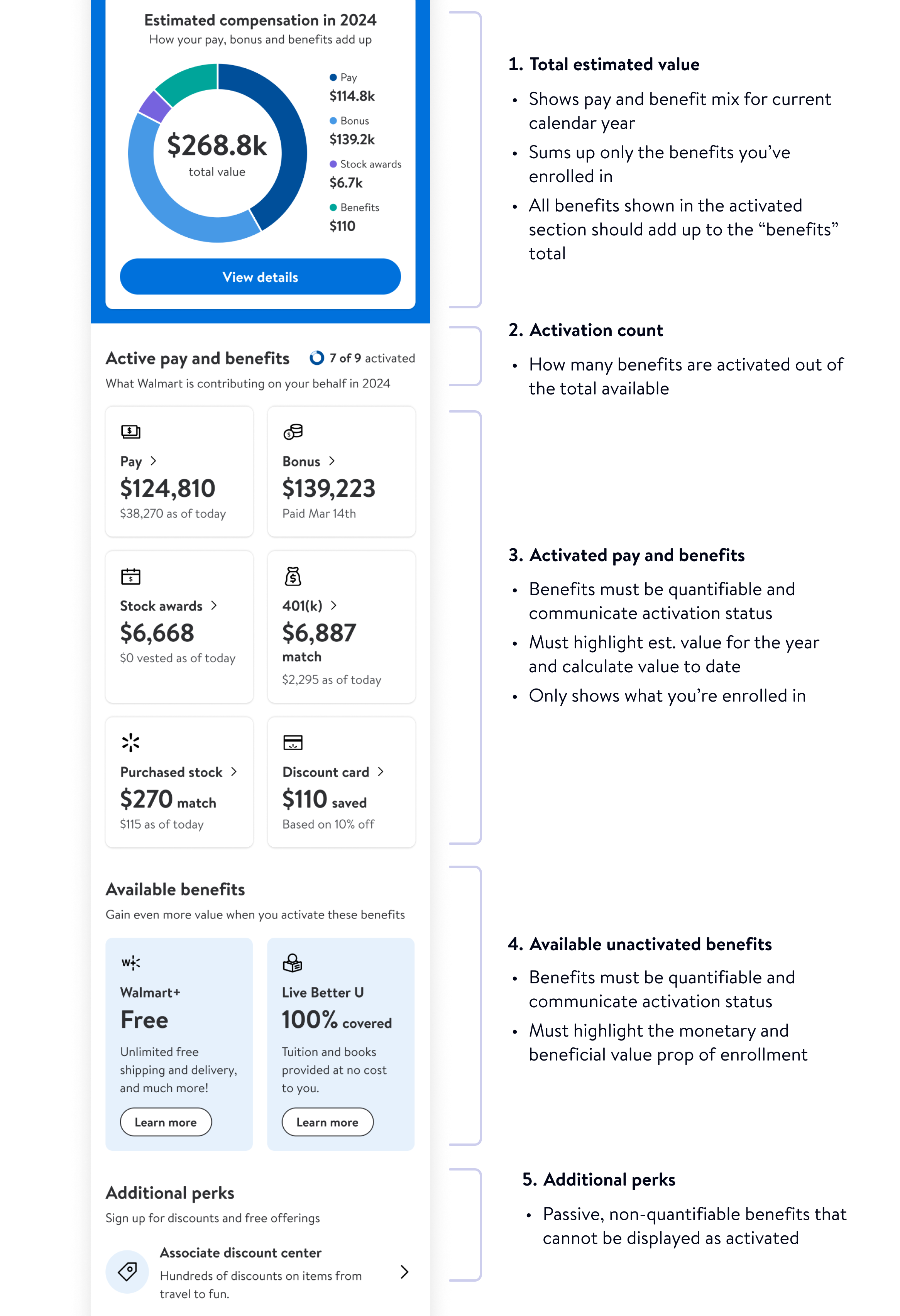
New key data visualization
“Unlocked” --> “Activated”
Updated benefit tile design
Addition of “Estimated” language throughout experience to clarify values shown are subject to change
Before
After
2 types of benefits
While we were building for MVP, I was also thinking about the future state in a parallel path. I knew that in the future, there would a bunch of benefits coming down the pipeline around health and well-being which could never appear as “activated” in our app due to technical constraints from partner systems, as well as legal implications.
This meant that I needed to create a separate class of benefits, passive benefits.
Active benefits
Walmart knows the usage status
Benefit value can be calculated into total comp package
Examples:
Bonus
401K Savings
Passive benefits
Walmart can not know the usage status
Benefit value can not be calculated into total comp package
Examples:
Associate discount center
Fitness pass

Dashboard goals
Help associates understand at a glance
Their total comp value
Pay mix breakout
Their activated benefits
Benefits still available
Additional perks (non-quant benefits)
Benefit Details
Split pay and benefits into two tabs
Remove unlocked section, only show benefits that are enrolled
Updated page hierarchy
Before
After
Bonus
Simplify complex information
Passive experience --> Interactive
Fit interactive experience in one viewport
Updated language and hierarchy
Before
After
Stock
Equity --> Stock
Simplified summary
Filter by Award --> Filter by Year
Updated data vis and chart interaction
Before
After
Deferred Compensation
Senior Exec specific benefit
Scenario selection only to planning based around your individual needs
Standardized chart interactions across experience
Before
After

Me@ Walmart
MVP for all personas
The final handoff included 7 different personas across 4 container apps.
Me@ Sams Club
Me@ Campus
Key Takeaways


